
It’s been widely publicised that this crisis is different from the GFC, as its origin is medical in nature as opposed to financial.
This has prompted us to assess financial markets differently, as the government and institutional responses have been different from previous crises.
Today I want to share with you the key indicators that we are looking at, as we glean meaning from price action, and make forward-looking assessments. This will mean a lot of charts, but please bear with us as they will paint a picture of intertwined meaning.
Monetary Policy
The outright level of interest rates is lower than those seen in 2009, and our yield curve is also flatter.
After the GFC the difference between 3y and 10y yields was 1.2%, whereas now it’s close to 0.7% – and with low inflation expected for the foreseeable future.
Green = today’s yield curve, Yellow = January 2009’s yield curve
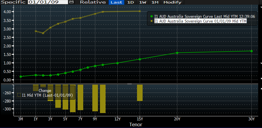
Source: Bloomberg
One of the reasons for the flat yield curve is the RBA’s recent deployment of unconventional monetary policy via quantitative easing (bond purchases), and yield curve control (pegging interest rates).
The RBA is maintaining our 3y government bond’s yield at 0.25% – keeping a permanent bid at that level, so that if yields were to rise above this rate, they would effectively buy all bonds trading at this level through secondary market purchases.
This will keep the yield curve flat for the foreseeable future, as long as the target is maintained and the guidance around the Overnight Cash Rate is stable for the years to come.
However, I have the view that if the yield curve did steepen somewhat, central banks may view this favourably as it would provide assistance to bank profitability (net interest margins) in a period where they are threatened by a sizeable default cycle.
Unconventional Monetary Policy
The QE program, as well a volatility in asset prices leading to cash hoarding, has seen surplus bank balances at the RBA spike from historic levels that remained consistent of time.
Surplus bank balances have averaged ~3billion AUD for the past 5 years, which quickly changed in early March 2020.
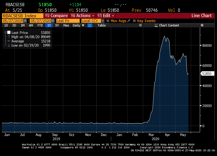
Source: Bloomberg
While these bank balances have reduced since their peak at March quarter end, the aggregate level remains elevated.
These balances are a key indicator of investor sentiment, and are a fear index of sorts, with peak fear for Australian investors being reached in late March, early April – around the time isolation policies were in play.
This is also the result of reduced financial markets activity – where there was little to no primary bond issuance, and cash supplies were increased with less bond supply.
As primary market activity returns to the AUD market, we are seeing these balances drop.
Term Funding Facility
However, one of the new policy initiatives out of the RBA – the Term Funding Facility – developed to give low-cost finance to banks to be passed onto SME lending – has not been drawn-on in quick fashion.
In fact, last week’s update from the RBA showed that there was roughly $5.8bio AUD drawn from the facility since first announced at the end of March – meaning there is $84.2bio still spare to be drawn.
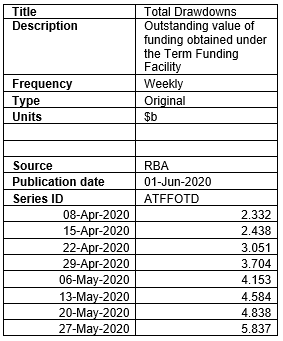
Source: RBA. Publication date 01-Jun-2020
If you share our view that Australian banks are not going to materially grow their lending books in 2020 calendar year (net of existing loan amortizations), then these cash balances will likely:
a) remain in cash at near 0% yields; or
b) be deployed to high-grade fixed income investment, where we’re already seeing recent primary bond issuance several times oversubscribed. This may continue to happen for future primary bond issuance, and while bank cash accounts’ value may decline as cash is deployed, the TFF will slowly drawn upon to replenish bank coffers.
Our Australian dollar (AUD)
Our AUD has followed the Chinese yuan (CNH) for a number of years, though this relationship has broken down since April.
While not “joined at the hip”, they do trend in the same direction for trade-related reasons and investor risk-appetites.
Since the start of April, this trend broke down and the currencies are negatively correlated now, as the Risk On / Risk Off (RORO) relationship has not held.
Australia has continued to remain a Risk On proxy, with less COVID-19 related worries than other nations.
Chinese yuan on the other hand, has struggled as the USA has re-started rhetoric looking to restrict Chinese government authority in Hong Kong, and contesting that China was a contributory cause to COVID-19’s outbreak around the world.
Green = AUD/USD, Red = CNH/USD
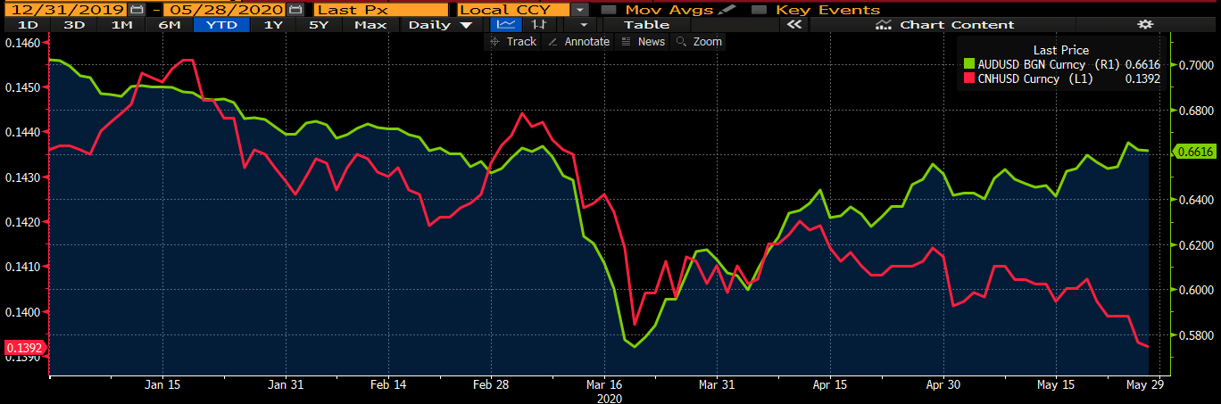
Source: Bloomberg
International flows
A real-time indicator of world trade flows is to chart currency movements by time zone. The below chart depicts our AUD against the USD (AUD/USD), broken up by time zone
Light blue = APAC, Green = European, Beige = American time zone
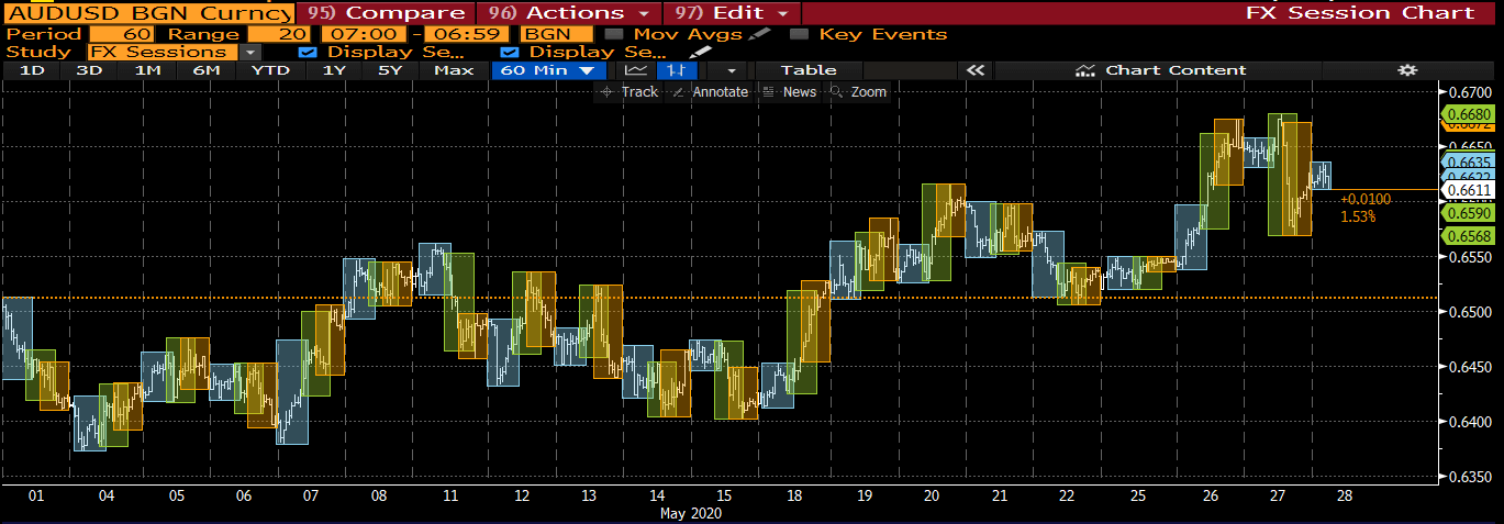
Source: Bloomberg
You will notice that our AUD is rallying during APAC hours and tends to sell-off during European and American trading hours.
This is indicative of APAC based investors – probably Australians – repatriating foreign currencies back to AUD, selling foreign to buy AUD – but also foreign based investors buying AUD assets. This will be split between businesses, individuals and asset managers.
Valuing our AUD/USD against traditional Purchasing Power Parity (PPP) methodology suggests our currency should be even higher, towards 0.75c/USD.
This goes hand-in-hand with a recent missive of ours tabling the increase foreign participation in our bond markets, due to the relative attractiveness of Australian yields and the political and health certainty we exhibit.
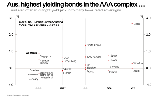
Source: Westpac
Concluding remarks
These indicators re-enforce that the Australian nation has strong fundamentals – political stability, rule of law, separation of judicial system from parliamentary – and that our country is less affected by the health crisis compared to other nations.
Because of our stable political economy, our currency often touted as a “risk on” asset, has been resilient during the pandemic and foreign investors are enticed by our higher-than-other-nation’s yields.
We will continue to watch bond market flows – as the “wall of money” available as dry powder, continues to target new primary issuance in high-rated fixed income securities and investments with strong liquidity credentials.
The views expressed in this article are the views of the stated author as at the date published and are subject to change based on markets and other conditions. Past performance is not a reliable indicator of future performance. Mason Stevens is only providing general advice in providing this information. You should consider this information, along with all your other investments and strategies when assessing the appropriateness of the information to your individual circumstances. Mason Stevens and its associates and their respective directors and other staff each declare that they may hold interests in securities and/or earn fees or other benefits from transactions arising as a result of information contained in this article.
